Designing for Compassion: The Never Alone Recovery App
Problem
Outcome
Designing for the Lowest Point in a Person's Life
When casual musings with a non-profit client bloom into discussions about an actual product design, the result is something like the Never Alone Recovery (NAR) mobile app, conceived as an on-demand accountability companion that would motivate daily progress, promote reflection, and give users access to other real-world resources the moment they're needed.
As Lead UX & Visual Designer on the project, I was tasked with establishing the visual language for the product over a 5-week sprint, tapping into a deep sense of empathy, restraint, and ethical precision. Recovery is an emotionally volatile space, and design missteps can cause harm.
Through early discovery sessions with people in recovery and two licensed counselors, we found a serious hole in the marketplace. The closest apps available didn't have the functionality the NAR app sought to provide. We hoped to create something that feels like a motivating sponsor, not an authority.
To achieve this, we took a small amount of inspiration from apps like Strava and MoveSpring, which are community-driven fitness tools where you can set goals and even compete with your friends. The aim for the Never Alone Recovery app was to essentially turn sobriety into a semi-gamified loop, but instead of competing with friends, users are holding themselves to account (and rewarded for the effort).
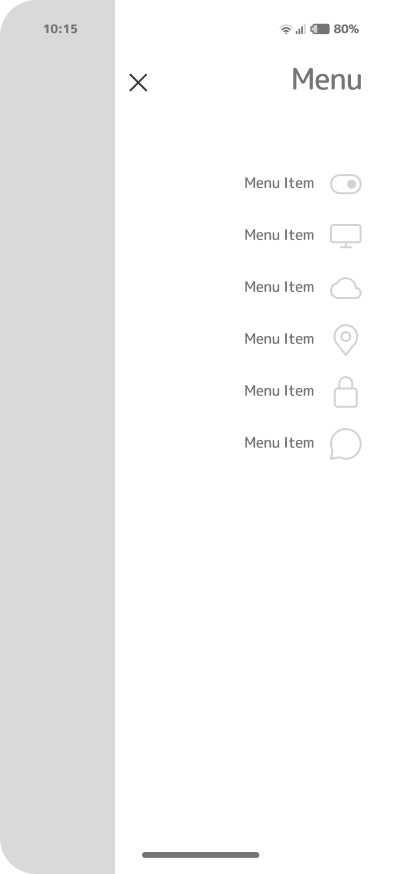
Where Empathy Meets Interaction
The NAR app design process balanced behavioral psychology, user research, and ethical UX. I conducted qualitative interviews, created empathy maps, and defined a dual information architecture:
- Daily Experience Flow: Dashboard → Reflection Prompt → Community Insight
- Support Flow: Sober Tracker → Sponsor Link → Encouragement Notifications
This structure mirrored the natural rhythm of recovery: reflection followed by reinforcement. It allowed the product to offer daily momentum while maintaining personal grounding.
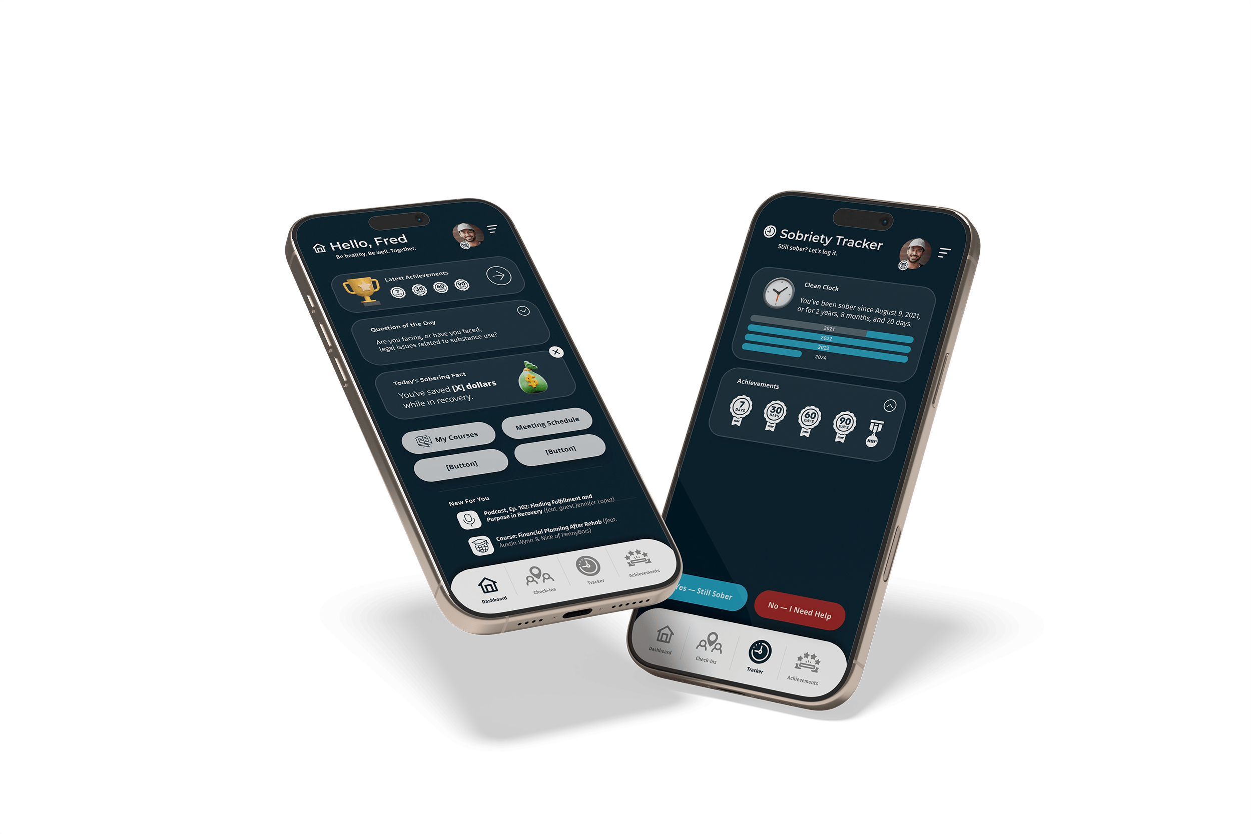
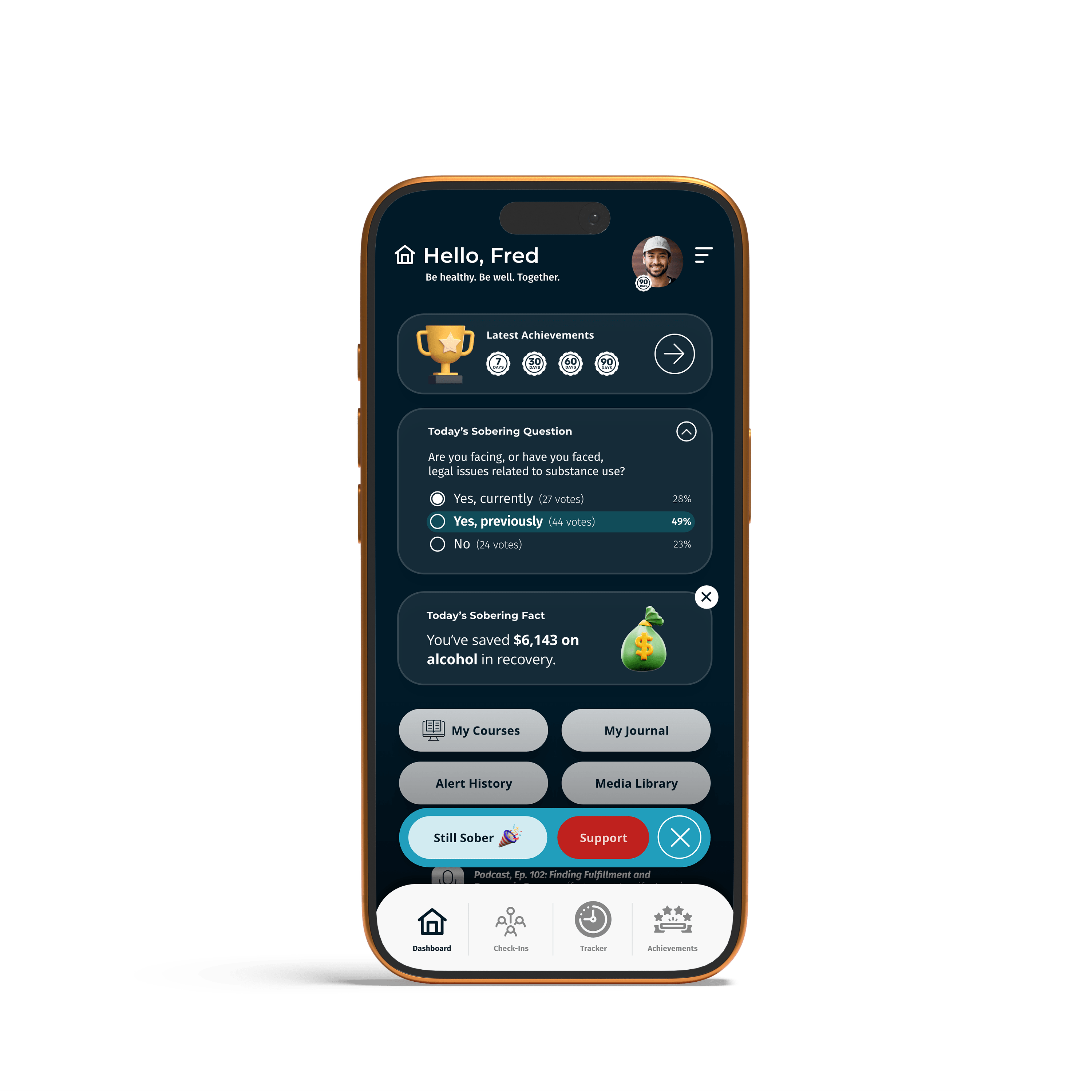
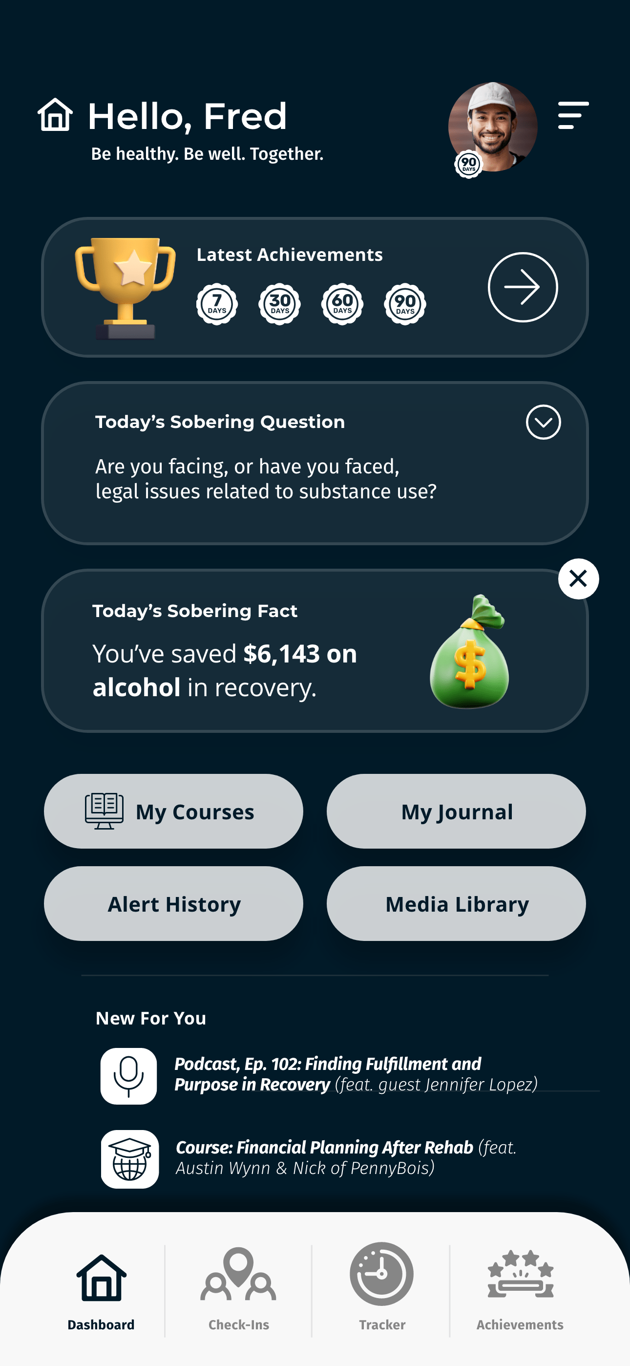
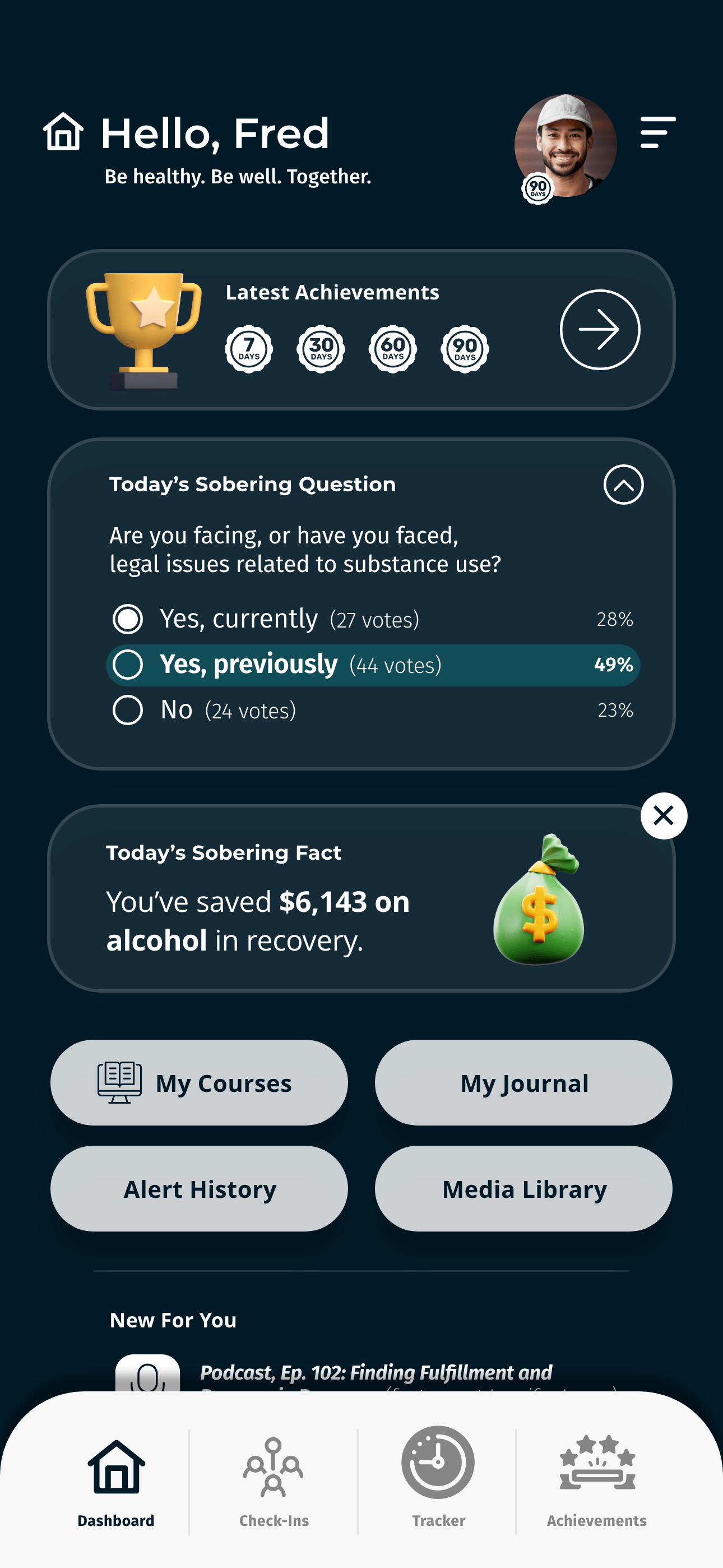
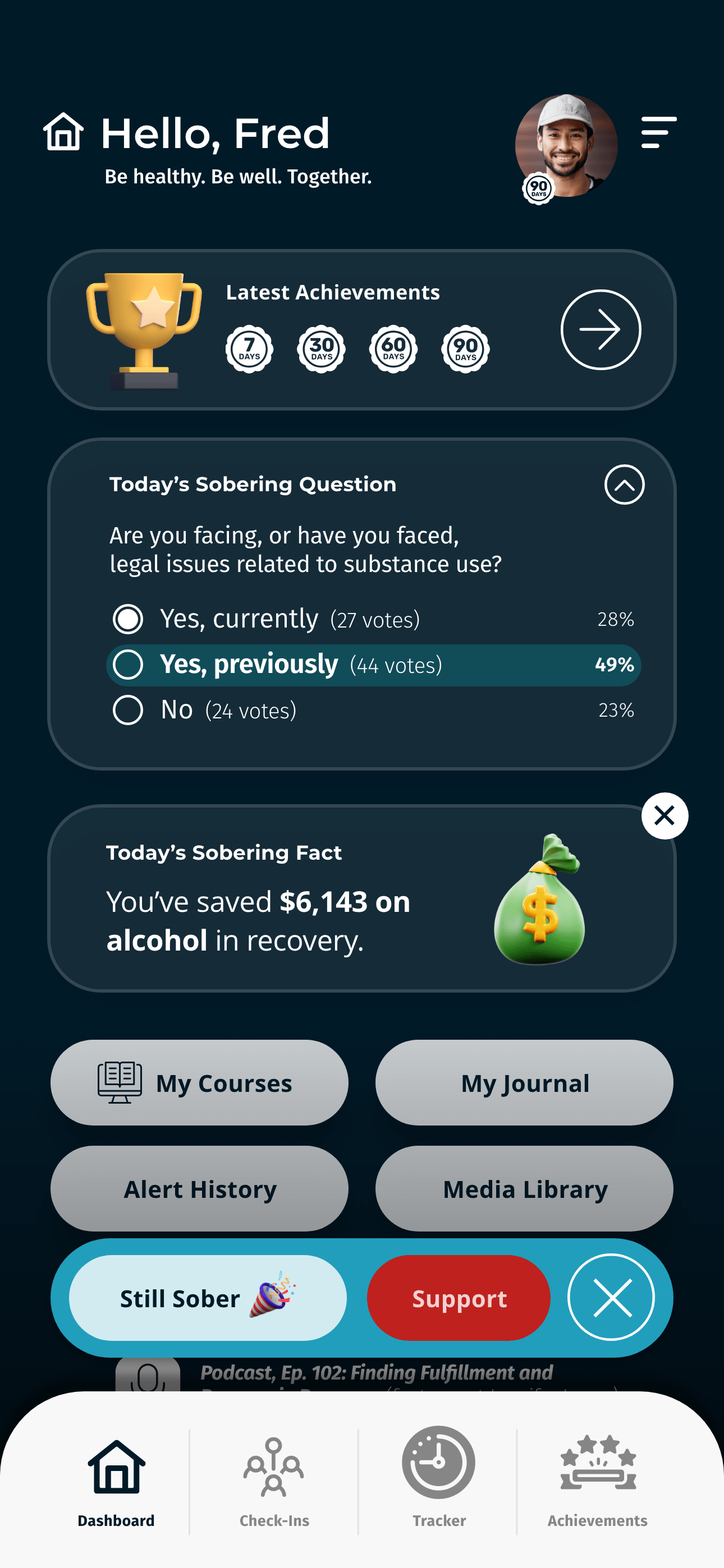
- A visually clear dashboard showing streaks, money saved, and milestones.
- Motivational check-ins and community polls that create belonging.
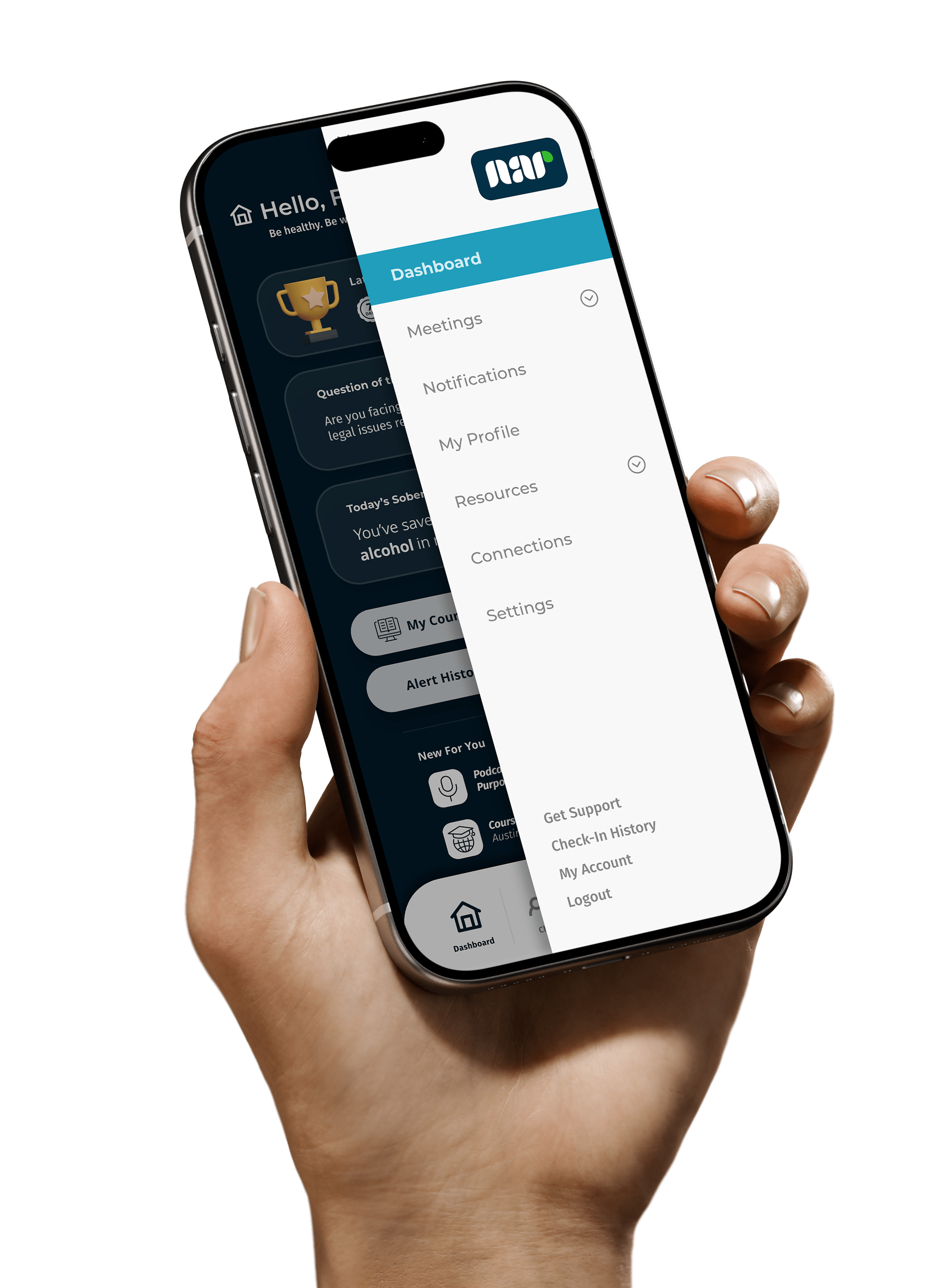
- Private, secure data handling that doesn’t feel invasive.
- Dynamic feedback—positive reinforcement instead of guilt.
- Secure dashboard with at-a-glance client risk indicators.
- Ability to send check-ins, reminders, and encouragement directly in-app.
- Automatic reports summarizing progress trends.
- Integration with the NAR App’s accountability algorithm to flag at-risk users.
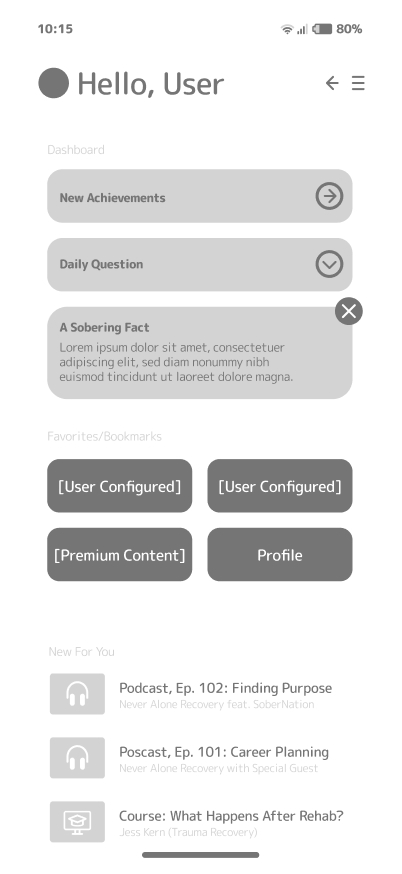
The Dashboard: Motivation & Momentum
The Dashboard was built to resemble a pseudo-social feed where users would be encouraged to reflect and where they'd find contextual recommendations based on where they were in the recovery process.
Users would log in and be greeted with some sort of daily engagement, often a fact of the day, poll, or maybe a running weekly tally of how much money they've saved over the course of their sobriety. This would be randomized to incentivize users to open the app each day.
These dynamic affirmations and metrics—e.g. “You’ve saved $362 since your quit date”—would remind users to celebrate milestones, reframing sobriety from deprivation to empowerment.
Visually, the interface was intended to be clean and consistent with open, highly readable typography, avoiding overly gamified elements, and focusing instead on subtle motion and meaningful affirmation.
Testing & Appraisal
Prior to the pilot phase, I ran informal usability sessions with 5 participants—all 5 were people in recovery, and 2 of them were sponsors.
Key takeaways led to 2 major changes:
- Simplified the check-in process to 2 screens.
- Replaced numeric scores with qualitative ranges (“Stable,” “Cautious,” “At Risk”).
Participants described the final tone as “gentle,” confirming that the emotional design goals were effective.

Pilot Testing Showed Promise
After pushing the app to the Google Play and Apple App Stores, we recruited a team of 35 community-sourced volunteers to try incorporating the app into their day-to-day lives. There were no incentives provided as we wanted to see how effective the app was at quickly establishing an emotional feedback loop.
They were asked to keep a journal of their reactions, thoughts, hangups, and suggestions for 30 days although there would ultimately be 2 extensions (60D, 30D) increasing the full pilot phase to 4 months. By day 120, there were 16 participants still using the app, representing 46% retention.
One journal included: "The app does a nice job of not making me feel judged... I noticed that if I mention having a craving in one of my journals, finding a local support group meeting will become my top suggested activity. That was surprisingly thoughtful."
Another user journaled: "I'm living for these daily facts based on my own situation. I've got it set up to deliver a running tally of how much I'm saving on booze each week."
Although the pilot phase was extremely promising, the client ultimately paused development, leaving the app unreleased. Based on my limited understanding, the client was having trouble securing sponsorship to help subsidize development costs.
Despite the stunted outcome, I'm extremely proud of the project, which stands as proof that ethical UX can coexist with data science without judgment.
Closing Thoughts
In hindsight, the Never Alone Recovery (NAR) App was a needed refresher in design ethics. You need to take a thoughtful approach to balance algorithmic rigor with compassion, data with empowerment.
It was a very unique concept and a fun project to work on, even without a wide commercial launch. Good UX isn’t just about impressive engagement graphs—it means building trust and connection with your end user.