From Concept to Credibility in 8 Weeks: Branding & Web Design for a $100M+ Holding Company

Problem
Outcome
Identity & Credibility From Zero
Vedara Ventures maintains a growing portfolio of more than 40 businesses representing over $100M in holdings across commercial automotive, hospitality, retail/grocery, and real estate—yet from the outside, Vedara was nonexistant.
No logo, no brand guidelines, no website, not even a LinkedIn company page.
With Q4 investor conferences on the horizon, the owners wanted to be able to present themselves better to potential partners and acquisition targets.
Goals
- Create a cohesive brand identity suitable for multiple verticals (e.g. commercial auto, real estate, retail)
- Design a flexible, intuitive website
- Target <2s load time and sub-40% bounce rate for B2B professional audiences
- Build scalable CMS for future portfolio entries without developer dependency
- Position company as investor-ready for Q4 conference attendance
Constraints
- $7.5K total budget for brand identity + website design/development
- Weekly stakeholder review cycles with little buffer/margin of error
- No analytics baseline or historical data (launching from absolute zero)
- All content written and produced in parallel with design work
- Hard 8-week deadline
As Lead Designer, I owned end-to-end strategy, brand identity development, UX/UI design, and WordPress development with Advanced Custom Fields. I worked intermittently with an SEO copywriter for content, but I personally controlled all design decisions—from information architecture and technical implementation to stakeholder presentations.


Strategic Branding: Balancing Speed, Flexibility & Authority
Because of the hard deadline, I took a closer look at the audience data, which largely consisted of venture capital investors, commercial B2B partners, and potential talent/collaborators.
The strategy centered on removing friction from business discovery—the two factors research showed mattered most to holding company audiences.
Since branding would have a major influence on the style of the website, I split the project into two phases, beginning with the brand design.
Phase 1: Brand Design
The first 2 weeks were focused entirely on brand identity, exploring a handful of possible directions before landing on the "nested V" monogram.
Phase 2: Website
Once the branding was finalized, weeks three through eight were dedicated to the website architecture, interaction design, and technical implementation.
This approach allowed the client to begin gathering portfolio case studies and credentials while I developed the IA and design system, maximizing the compressed timeline without sacrificing strategic thinking.
The Brand Challenge: Authority Across Industries
Unlike with a specific business vertical, the Vedara brand identity needed to work for a company with flexibility since it would appear in automotive, real estate, and hospitality contexts.
In discovery sessions, the client and I reviewed companies in a similar space and identified tracks to avoid: sterile minimalism and dated traditionalism.
We split the different and targeted "traditional minimalism."
Understanding the Audience
Through independent research and a few calls with the client, I developed three user personas to guide my design choices:
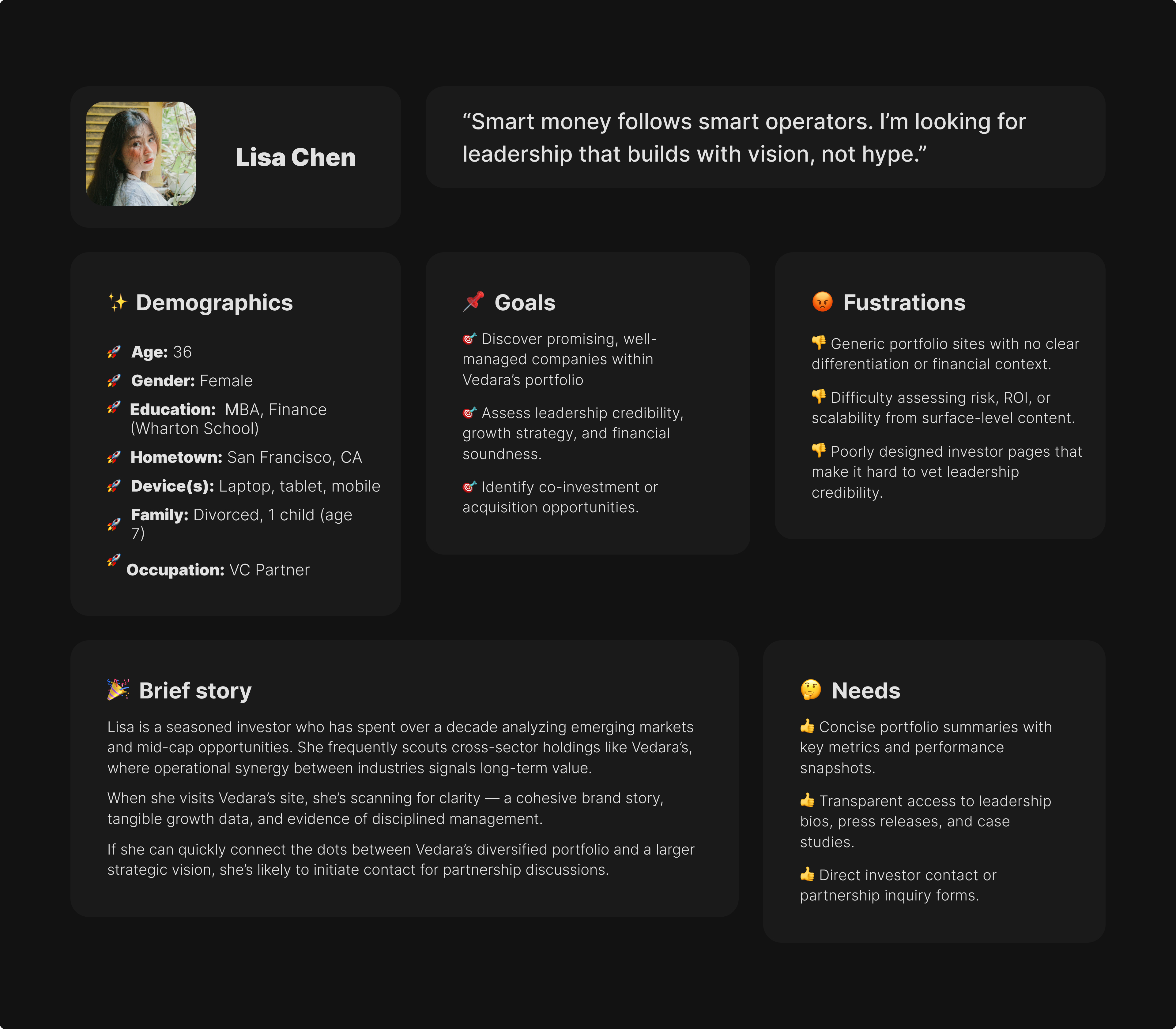
- Lisa Chen is a prospective VC partner looking for concise summaries, precise metrics, and transparency surrounding leadership.
- Daniel Ruiz is a construction/logistics partner who wants to understand who Vedara is, how they operate, and whether they deliver.
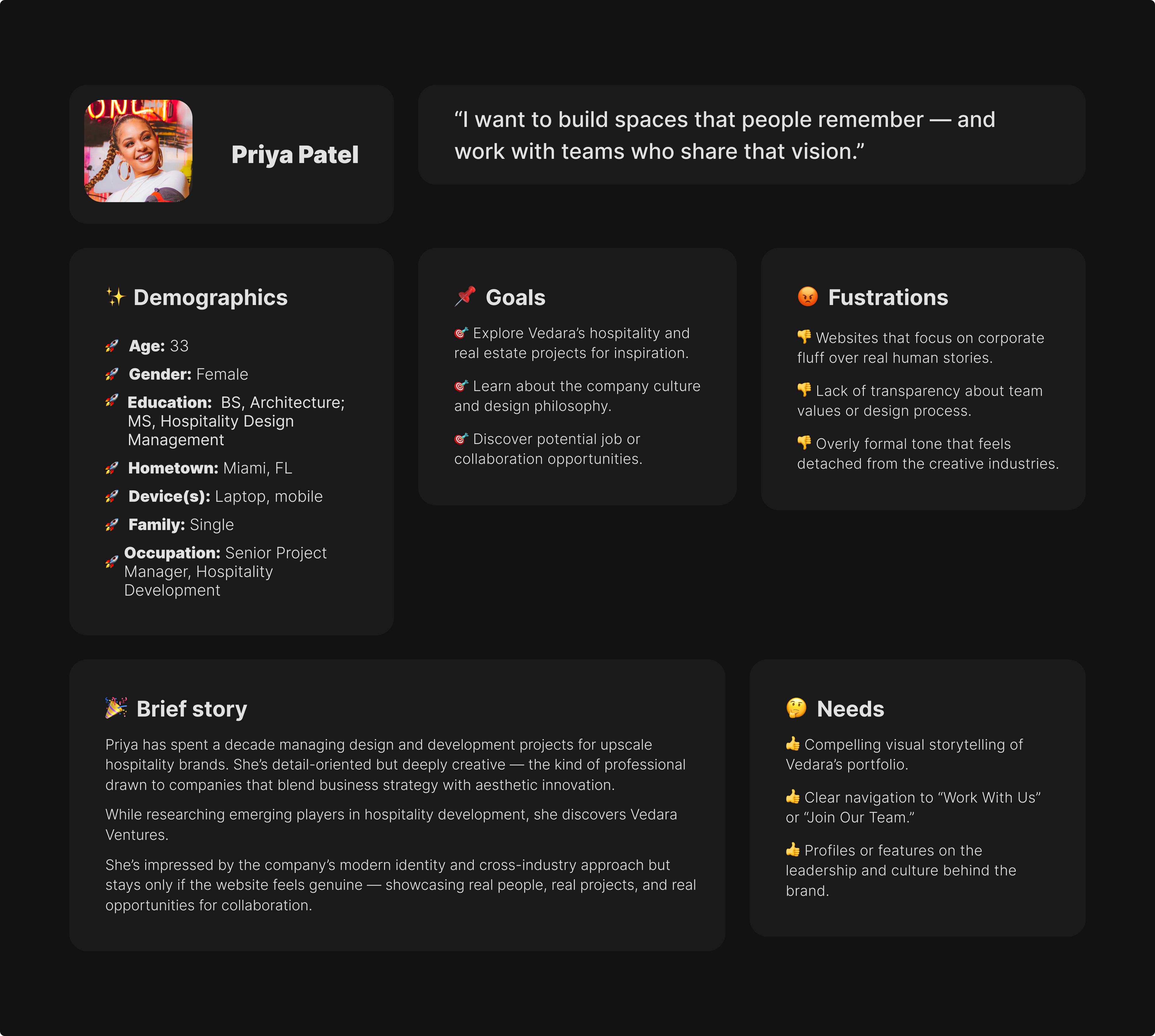
- Priya Patel is a hospitality program manager exploring collaboration opportunities who wants to better understand Vedara's culture and values.
The conference deadline motivated rapid stakeholder feedback—reviews within hours instead of typical week-long cycles.
Final Design
The double-V structure had immediate impact—strong symmetry, architectural feeling, clear name connection. Variations with different levels of concentric line work suggested layers and depth.
Final deliverables included logo suite (nested V with variations), flexible color palette (plum, flax, cerulean, rust, greige with tints), and Notion-based brand book with condensed PDF for implementation guidance.
Heading 1
Heading 2
Heading 3
Heading 4
Heading 5
Heading 6
Lorem ipsum dolor sit amet, consectetur adipiscing elit, sed do eiusmod tempor incididunt ut labore et dolore magna aliqua. Ut enim ad minim veniam, quis nostrud exercitation ullamco laboris nisi ut aliquip ex ea commodo consequat. Duis aute irure dolor in reprehenderit in voluptate velit esse cillum dolore eu fugiat nulla pariatur.
Block quote
Ordered list
- Item 1
- Item 2
- Item 3
Unordered list
- Item A
- Item B
- Item C
Bold text
Emphasis
Superscript
Subscript
- Compelling visual storytelling of Vedara’s portfolio.
- Clear navigation to “Work With Us” or “Join Our Team.”
- Profiles or features on the leadership and culture behind the brand.
Heading 1
Heading 2
Heading 3
Heading 4
Heading 5
Heading 6
Lorem ipsum dolor sit amet, consectetur adipiscing elit, sed do eiusmod tempor incididunt ut labore et dolore magna aliqua. Ut enim ad minim veniam, quis nostrud exercitation ullamco laboris nisi ut aliquip ex ea commodo consequat. Duis aute irure dolor in reprehenderit in voluptate velit esse cillum dolore eu fugiat nulla pariatur.
Block quote
Ordered list
- Item 1
- Item 2
- Item 3
Unordered list
- Item A
- Item B
- Item C
Bold text
Emphasis
Superscript
Subscript
- Concise portfolio summaries with key metrics and performance snapshots.
- Transparent access to leadership bios, press releases, and case studies.
- Direct investor contact or partnership inquiry forms.
Heading 1
Heading 2
Heading 3
Heading 4
Heading 5
Heading 6
Lorem ipsum dolor sit amet, consectetur adipiscing elit, sed do eiusmod tempor incididunt ut labore et dolore magna aliqua. Ut enim ad minim veniam, quis nostrud exercitation ullamco laboris nisi ut aliquip ex ea commodo consequat. Duis aute irure dolor in reprehenderit in voluptate velit esse cillum dolore eu fugiat nulla pariatur.
Block quote
Ordered list
- Item 1
- Item 2
- Item 3
Unordered list
- Item A
- Item B
- Item C
Bold text
Emphasis
Superscript
Subscript
- Clear presentation of Vedara’s business divisions with use cases.
- Client testimonials or case examples that demonstrate reliability.
- Simple contact pathways categorized by sector (e.g., Auto, Hospitality).
Website Design & Development: Architecture, UX, Testing & Performance
With brand identity finalized, I switched my focus to designing a website that's polished and easy for the client to use, particularly down the road as acquired companies would get added.
Information Architecture & CMS
Per the client's request, I used WordPress as the CMS, configuring a custom modular information architecture implemented with HTML/JS/PHP, custom plugins, and Advanced Custom Fields. Dynamic data fields ensure that even a small amount of WordPress familiarity made adding new businesses a breeze.
Validation & Testing
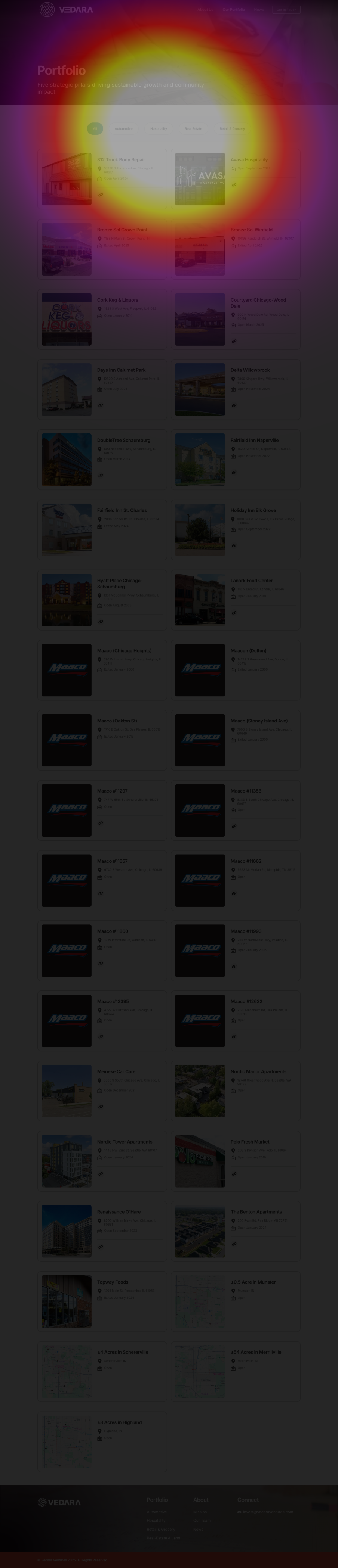
To test my design, I recruited 12 remote usability testers matching Vedara's actual audiences (business owners, VCs, entrepreneurs) through Lyssna. I gave the testers two tasks:
- Filter the portfolio to a specific business [pictured]
- Use website navigation to locate the owners
The testing confirmed that the simplified navigation structure aligns with the behavior of business decision-makers as they navigate and search for information.
Performance Strategies
Fast sites signal operational competence to B2B audiences. I set a performance target of under 2 seconds average load time, which required deliberate technical decisions:
- Image compression with lazy loading
- GSAP for micro-animations
- Reduced motion density on mobile
- Critical CSS inlined
- Conditional asset loading
Design Approach
The visual design effectively conveys the calming tan, accents of rich plum, generous white space, and a somewhat minimalist aesthetic.
Key features and considerations included real-time filtering using React/Javascript, mobile-optimized 48px touch targets, and GSAP polish on interactions without sacrificing speed.
Technical Performance & Usability Validation
Testing revealed strong alignment between the design and user expectations:
- Portfolio filtering: 100% task success (12/12 users found target companies easily)
- Navigation: 83% first-click success (10/12 users)
- Feedback: Every participant described the business directory as "easy" or "intuitive"
The 17% of navigation testers weren't actually lost—they were exhibiting a very common orientation behavior called information foraging, ensuring that there's not additional information to consider, before ultimately clicking the identical link in the footer.
However, the 100% filtering success mattered most—if users couldn't quickly find businesses by industry, the site would fail its primary purpose.
Technical Performance
The site launched with performance metrics exceeding B2B industry standards:
- Load time: 1.9s (industry average: 3.7s) — 49% faster than typical B2B sites
- Lighthouse performance: 94/100
- Accessibility: 99/100 (WCAG 2.2 AA compliant)
- Mobile performance: Matched desktop despite 40% motion reduction for optimization
Early Behavioral Patterns
Hotjar tracking revealed promising engagement patterns:
- 72% of users interacted with industry filters within their first session
- 88% scrolled through the complete portfolio grid (high engagement, low bounce)
- 31s average on About page (above the 15-20s typical for B2B company pages)
Users were engaging deeply with prioritized content rather than bouncing after the homepage. They came to evaluate the portfolio, which the IA supports.
Operational Impact & Design Validation
The brand and website positioned Vedara as investor-ready in 8 weeks—transforming content management from technical bottleneck to simple business operation.
CMS Efficiency
The team added two companies to the portfolio with zero training—each taking 3-5 minutes versus the $1,500-2,500 and 1-2 week timeline traditional implementation requires.
As the portfolio grows, each new business can be represented online immediately—no delays, no costs, no bottlenecks.
Meeting the Deadline
The 8-week delivery (versus typical 12-16 weeks for similar scale) came from strategic sequencing: brand-first, then website. This eliminated the usual "does this feel on-brand?" back-and-forth because the brand existed before design started.
Business Value & Operational Efficiency

Closing Thoughts
This project reinforced something I've seen across multiple branding and web builds: Tight external deadlines force better internal decisions.
With 8 weeks total and Q4 conferences looming, stakeholder feedback became immediate and decisive. The timeline didn't compress my process—it compressed their deliberation time, eliminating the typical week-long "let's think about it" cycles that drag projects out.
The brand came together quickly. I'd anticipated 3 weeks, but client urgency compressed it to 2 weeks without sacrificing exploration or quality. When stakeholders have real deadlines and clear objectives (investor readiness), they evaluate concepts against specific goals rather than subjective aesthetics. I saw this pattern with the color palette: The first attempt, which combined off-white with navy (versus plum in the final), was a miss because, according to the client, it "looked like a mortgage company." That clarity accelerates everything.
If I could redo anything, I'd push harder to launch GA4 on day one instead of deferring it to later in the process. Since the client was laser-focused on conference readiness, I didn't want to add scope that might jeopardize the timeline.
The modular CMS proved its worth faster than expected. Watching stakeholders successfully add portfolio companies within weeks—with zero training—validated that the content structure was intuitive for non-technical users. That immediate adoption matters more than any usability score.
Most significantly, this project validated that brand and website should develop sequentially, not in parallel. The 2-week brand-first approach meant every website decision was grounded in an established visual system. I wasn't designing a website while simultaneously inventing the brand—I was translating an existing identity into digital form. That clarity accelerated development, ensured consistency, and eliminated the usual "does this feel on-brand?" debates. It's a strategic sequencing I'll absolutely be replicating on future dual-deliverable projects.